Occasionally we engage in something frivolous, and almost always that exercise in goofing off is to do with infographics. We have previously listed our top ten infographics for 2016 and now, three-quarters of the way through the year, these are our leaders in the race in 2017.
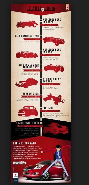
1. Manga’s most famous thief, Lupin III, has an impressive collection of cars. Here, Japanese car manufacturer Suzuki teams up with Lupin’s creators to use an infographic as advertisement:
2. “Visual Guide to Marvel Character Movie Rights”, created by “The Geek Twins”, gives you more information than you would ever want to know about which motion picture studio owns which rights to which Marvel Comics character.
3. “The Giant Sized Omnibus of Superpowers, featured in Wired magazine, is the dedicated work of someone (at Pop Chart Lab) with far too much time on their hands.
4. “Distribution of Colours” by each of the big US superhero publishers, produced by Comics Alliance, is a brief but telling capture of the literal and figurative tone used by each of these two companies.

5. The Daily Dot’s “How similar are your favourite comic book shows?” demonstrates that, perhaps, they’re not so similar at all.
6. “The evolution of Manga” is a highly detailed analysis of the development of the popular Japanese genre:
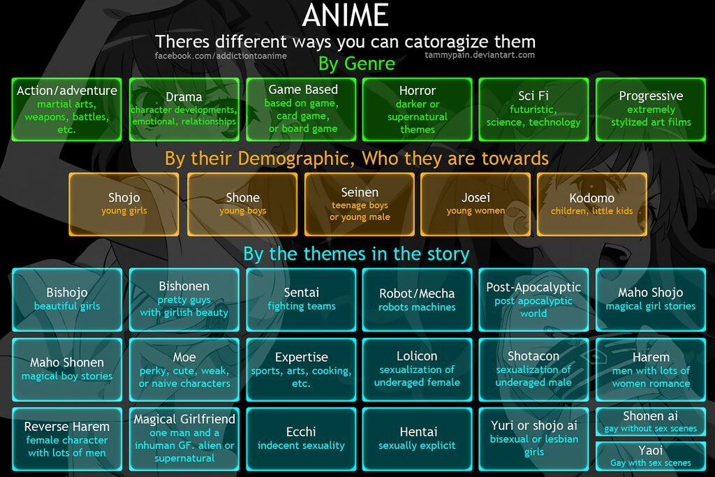
7. Finally, a wonderful chart by www.facebook.com/addictiontoanime on how to categorise the sub-genres, for those not in the know:
More to come as the year progresses.
(We have done our best to identify the creators of these infographics, and will happily acknowledge anyone who we might have missed.)


